… or how correct typography is a key part of developing your brand.
I’ll start by stating, I’m not against Comic Sans. It has its place and when it was created in 1994 by Microsoft designer Vincent Connare, he was filling a void typographically for informal help speech bubbles in Microsoft software, such as Word, for a casual, non-connecting script inspired by comic book lettering. At its core, it is intended for use in informal documents and children’s materials. 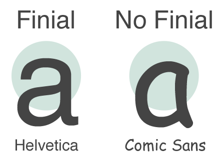 At that, it excels, for example, the fact that the lower case A doesn’t feature a ‘Finial’ (the curved bit) on the top and looks like handwriting aids with children learning to read and is known for being easy for Dyslexic people to read to. I can’t fault it for that but please, don’t use it on an ambulance or university welcome letter.
Typography can, in an instant, give someone a sense for your business and who you are catering for. It has the power to control the tone of voice and meaning of what you, or more importantly your brand, are trying to convey to the other people.
When it comes to developing a brand the decisions and considerations that are made when it comes typography have lasting effects on how your brand will be perceived. Your typography can be simple and ‘invisible’ acting as a way to get information across, whilst giving you service or product centre stage. Or it can boost your message and add value by enhancing your message in a visual way.
“It’s just picking the interesting font, right?”
The Collins English Dictionary defines typography as “the art, craft, or process of composing type” ideally making written language legible, readable and appealing when displayed, this is achieved through the use of appropriate fonts and typefaces.
“But, font and typefaces are the same things aren’t they?”
Yes and no, typefaces are the names for the complete family, e.g. Bodoni, whereas fonts are a choice from that family, e.g. Bodoni Bold. The reason this is important is it can vary wildly as to how many fonts a typeface may contain, an example would be if you asked me to use Helvetica Neue, I would have 51 fonts to choose from.
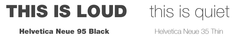
Every typeface has a personality, which can be leveraged to envoke an emotional response or spark an interest in the viewer that can do wonders for a brand. However, ignoring the characteristics of a typeface or making bad choices on their use can really turn a person off from a visual perspective and taint the message you are trying to express. A font in all caps and bold is arguably going to shout louder than a light font in lowercase (although this is all relative to situation and context within a design). For example:
When we, as designers, choose a font for a logo or a typeface for a brand we have done so for a reason, feel free to ask about the choice, we love to chat!
So I’ve told about how a font can make you ‘feel’, but at the end of the day does it really matter? Do people really care about the font on a design? The short answer is YES!
For example, back at the end of 2010 GAP launched a new logo, along with a whole new brand. They went for the crowbar method and completely changed their 24-year old brand without warning, seemingly over overnight.
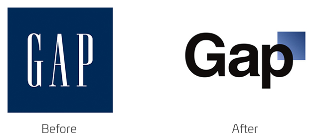
The old logo was a highly recognised, mostly typographic, mark and when it changed quickly gained a lot of attention for all the wrong reasons. People on the whole slated the design with it often being compared to a template in Microsoft Word. Due to the public backlash, the new logo lasted a whole 6 days before GAP switched it back. Most of this dislike for the logo came from people on social media, from a wide variety of backgrounds. It’s not certain but the GAP rebrand was estimated to have cost $100 million. Which is a lot of money to be globally panned and revert to what they had in the first place.